During the first wave of COVID-19 in 2020, official case counts in Lagos, Nigeria — a megacity of roughly 14 million people — captured only a small fraction of the true infections. We built a high-resolution computer simulation that reconstructs how the virus actually spread across the city in space and time, and used it to ask a policy question that is still debated: did mobility restrictions (lockdowns) really change the course of the epidemic, and how much did their timing matter?
Two ideas make our approach distinctive
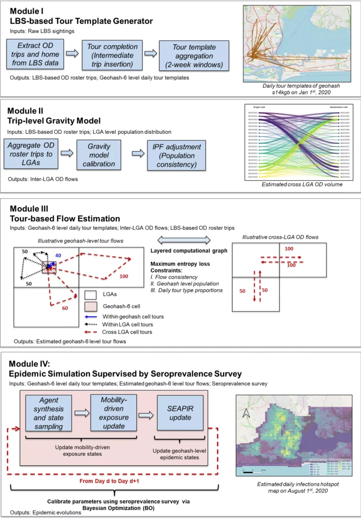
1) Agent-based model (ABM). Instead of averaging the population into a few equations, we simulate millions of individual “agents” who move around Lagos following realistic daily travel patterns reconstructed from anonymized location-based-services (LBS) mobility data. When agents share the same places at the same times, the virus can pass between them through a SEAPIR disease model (Susceptible → Exposed → Asymptomatic / Presymptomatic / Symptomatic infectious → Recovered).
2) Seroprevalence-supervised calibration. Because reported cases were unreliable, we anchored (“supervised”) the simulation to an independent antibody (seroprevalence) survey, which measures how many people had truly been infected. This forces the model to match reality in total infection burden — not just the visible, reported cases.
The calibrated model reproduces three independent real-world signals — a late-July epidemic peak, about 3 million cumulative infections, and the end-of-period infection level — revealing a largely invisible epidemic roughly 140 times larger than official case counts. It estimates that mobility restrictions prevented about 1.53 million infections (a 33.8% reduction) compared with a no-lockdown scenario.
How the simulation works (four modules, top to bottom): mobility data → individual travel agents → SEAPIR transmission → calibration supervised by a seroprevalence survey. Full-resolution source: workflow-v5.
Key result 1 — The evolution of new infections, and why lockdown timing mattered
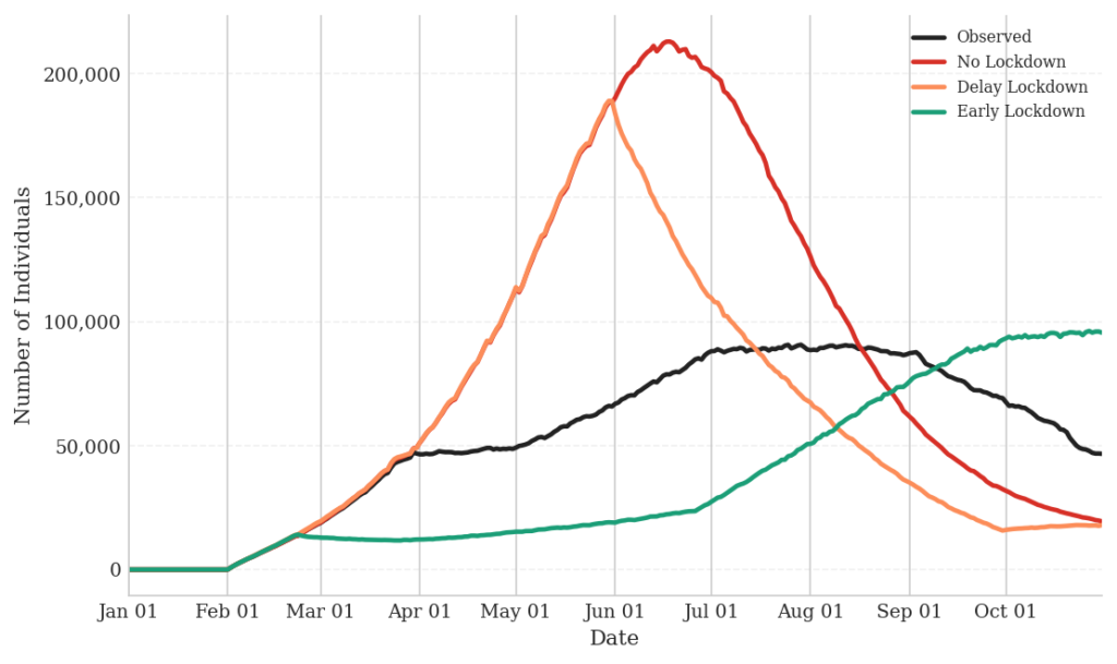
The chart below tracks the daily number of newly “Exposed” individuals — people who have just caught the virus. This is the leading edge of the epidemic: it rises first and reveals the true transmission dynamics before symptoms and testing catch up. Each curve is a “what-if” scenario run through the same model.
Daily newly-exposed individuals under four scenarios: observed (what actually happened), early lockdown, delayed lockdown, and no lockdown.
Early action flattens the curve and pushes the peak later. The no-lockdown scenario produces a sharp, early explosion of infections (over 4 million by the end of October). A delayed lockdown tracks the no-lockdown curve at first, then drops abruptly — an “emergency-braking” effect that only takes hold after most of the damage is already done. In short: the same restriction was far more powerful when applied earlier.
Key result 2 — Where the virus spread: spatiotemporal hotspot heatmaps
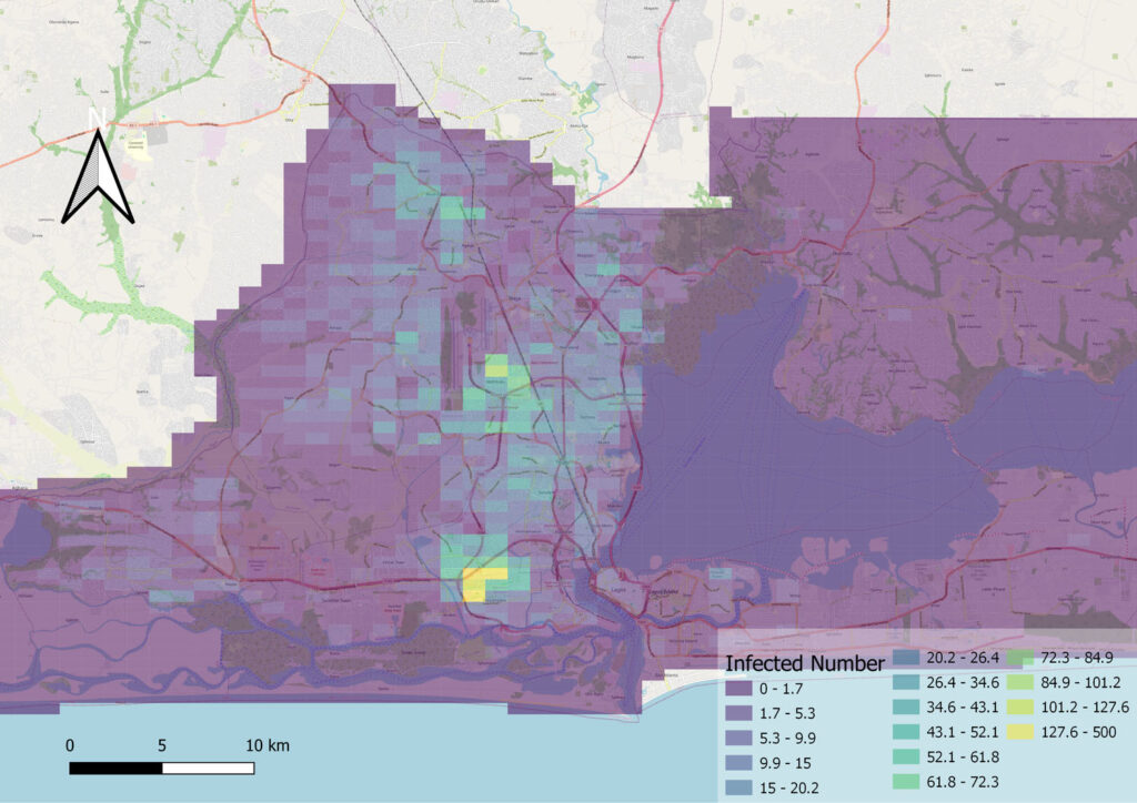
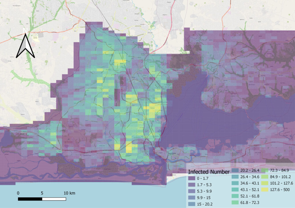
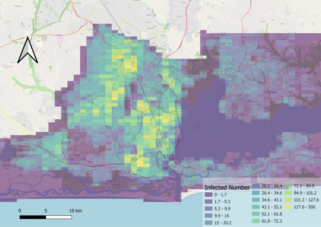
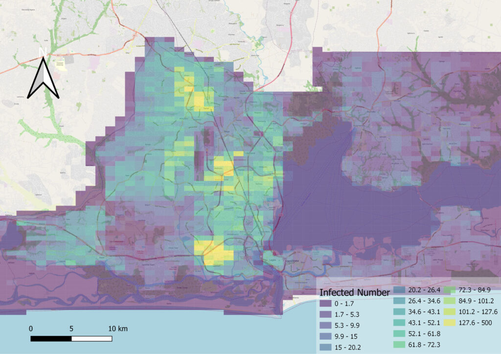
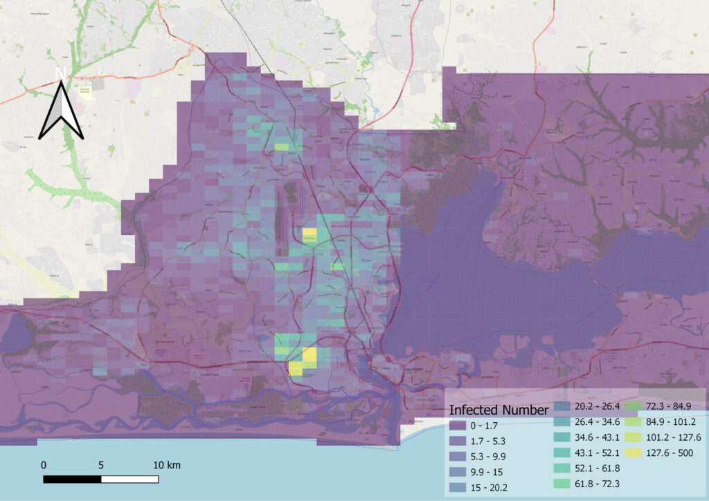
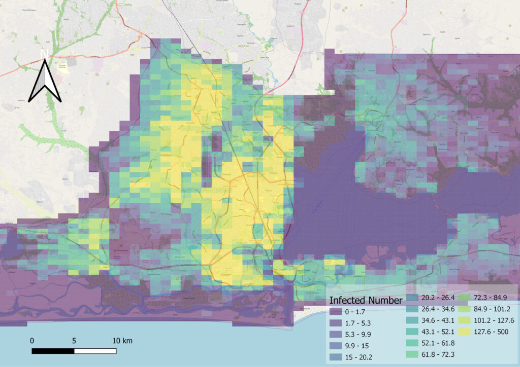
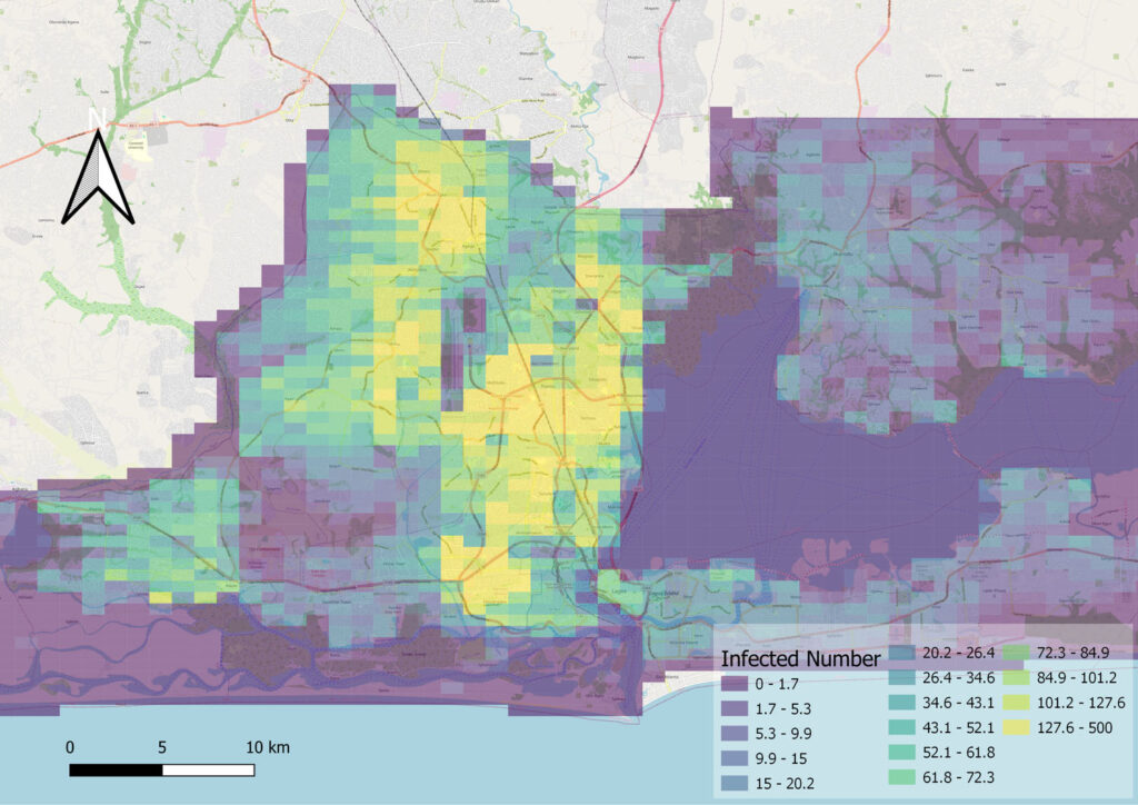
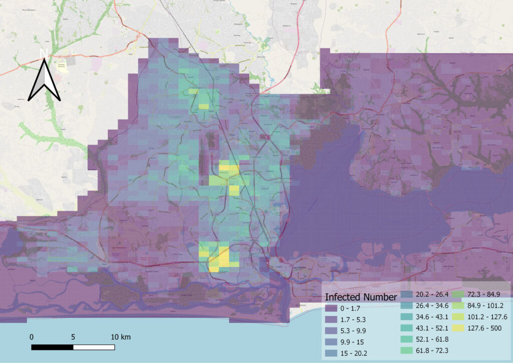
Important: every map below is a simulation result — the model’s estimate of where active infections were concentrated on each date, not raw surveillance data. Warmer colors mean higher infection density. We show two scenarios so the maps can be compared side by side.
Scenario A — Observed mobility (our reconstruction of the actual first wave)
Mar 1 · seeding · ~7k active
Jun 1 · expansion · ~28k
Aug 1 · peak · ~40k
Oct 1 · contraction · ~32k
Simulated under the real, observed mobility of 2020. Transmission ignited around a few dense transport hubs — Agege, Oshodi-Isolo, Ajeromi-Ifelodun — was held in check during the April lockdown, expanded after reopening, peaked in August, then retreated to a few persistent reservoir hubs.
Scenario B — “No Lockdown” counterfactual (a what-if simulation)
Mar 1 · seeding · ~7k active
Jun 1 · rapid spread · ~79k
Aug 1 · peak · ~63k
Oct 1 · herd-immunity fall · ~16k
A simulated “what-if” in which pre-pandemic mobility continued and no restrictions were imposed. The same hubs ignite far earlier and hotter — active infections reach roughly 2–3× the observed levels by mid-year and blanket the mainland — before burning out through herd immunity rather than policy. The gap between Scenario A and B is our core estimate of what mobility restrictions prevented.
Key takeaways
Mobility shaped the epidemic — relaxing restrictions in May triggered rapid acceleration.
Timing was decisive — earlier lockdowns flattened the curve; delayed ones only “emergency-braked” after wide spread.
Transmission was spatially concentrated in a few transport hubs that acted as seeds and long-lived reservoirs.
The real epidemic was ~140× larger than reported — recovered by anchoring the simulation to a seroprevalence survey.
The method transfers to other diseases and data-scarce cities.